Improving perceived interface responsiveness on public kiosks
Tuesday, July 9, 2019
Click here to go to all posts. Also published on the Intersection blog
Bringing digital experiences to physical spaces requires a sense of immediacy
Sense of immediacy
One of the most compelling aspects of a kiosk experience is a sense of immediacy: that your interactions with the screen will immediately cause something to happen without perceptible delay. In many ways, this is due to the fact that we are filling a void previously occupied by analog signage, paper printouts, and folding pamphlets.
What do these have in common? Well, they don’t have a loading time. They’re physically present, waiting for a passerby to point to, pick up, or peruse.
This leads to a peculiar problem: how do we create kiosk products and web apps that have the same sense of immediacy and physicality as printed materials.
While there are plenty of approaches to achieving that goal, for us at Intersection, it often boils down to showing what the user wants as fast as possible.
Techniques we use
In order to drive speed and perceived responsiveness, we use a variety of web development techniques.
Pre-rendering and off-screen/hidden rendering
It often takes several seconds for high-quality, computationally-complex assets to load. Examples of this include:
- Very high-resolution images
- Complex, highly-interactive DOM- or SVG-based visualizations
- Assets built and rendered using canvas or WebGL
We have a few approaches for these resource-intensive assets. First, we try to render them ahead of time. While this does not eliminate all performance issues, it can dramatically reduce them. For example, rather than load data into a WebGL rendering every time the rendering is requested, it is less computationally intensive to simply load the data once and change where on the screen the rendering is displayed.
One variation of this technique is off-screen (or hidden) rendering. This is fairly common across all web development, but it becomes especially useful when applied to these assets which require more intensive processing. Browsers are complex applications. By changing the workload from rendering an asset to simply moving an already-rendered asset’s output location, we significantly reduce the number of processing paths needed to display that asset onscreen.
This also forces engineers to think about asset reuse more broadly. The more assets can be reused in terms of both their data and rendering, the greater the perceived speed will be. This is covered more in depth in the next section as a broader technique.
Asset reuse
As mentioned in an earlier post, we use standard web app practices and tools to build our smart city kiosk products. Web technologies such as React.js allow us to build reusable components while Redux gives us a consistent view of our data across the entire app.
The Redux store acts as a single, reusable source of truth for the various parts of the app. This means that the latest train arrivals or directory information need only be updated once and that update will be felt in all locations throughout the app.
We also focus on the reuse of static assets. For example, SVGs not only minimize asset size but also allow us to reuse them for locations with different sizing. A simple change to the CSS and we can adapt the SVG color to different contexts, rather than relying on multiple static assets.
As you’ll read about in the next section, we use pre-caching and caching with our assets in addition to reusing them. Performance is increased when you load things only once and transparently reuse them across the entire app.
Advanced, opportunistic caching
We rely heavily on advanced caching through the use of service workers for our kiosk web app. When initially developing the app, we started with the more common patterns, including pre-caching of static assets and caching most of our API calls.
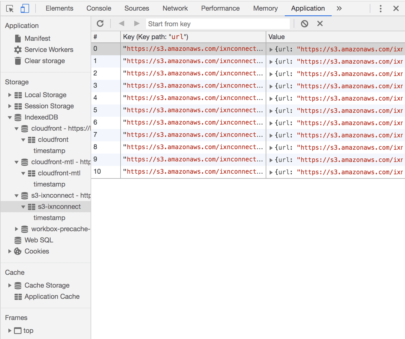
However, we’ve added additional logic since then which is a bit more use-case specific. For example, we need to make sure to only show information that has refreshed recently and is not “expired.” In order to achieve the concept of information expiry, we keep track of cache age and provide an interface for the web app to know that age. Thus, we can determine whether or not data is “too old” on a feature-by-feature basis.
Another interesting technique we use is the limited inclusion of fetching additional data when caching in the service worker. For example, when we load a third-party SDK for indoor mapping, we cache the API calls made to retrieve data. Furthermore, we look through that data in the service worker and then reach out to cache some of the assets referenced in that data.
Example uses
While the places in which we use these techniques are numerous, here are a few examples where their absence would have been detrimental to the user experience at best, and at worst, would have prevented that feature from launching at all.
3D directory map
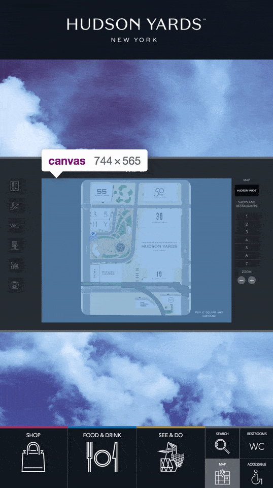
One of the more complex examples of using these techniques to provide that desired sense of immediacy is the 3D maps present on our urban kiosks at Hudson Yards in New York City.
These maps are highly-designed, 3D, interactive interfaces. In order to achieve the desired experience, it takes a perceptible amount of time to load and render these maps on a screen, including on a kiosk. If you haven’t used the map, you can visit the directory map on the Hudson Yards New York website to see the same map.

Unlike on a desktop or mobile website, where a user may be more willing to wait for a map to load, the benchmark we are unconsciously compared against is analog signage. Shoppers are likely accustomed to a large printed map of the mall, which effectively has a loading time of zero.
As a result, we need to pre-render this 3D map offscreen when the kiosk starts up. That way, it will already be “present” when the user wants to see it. Additionally, we only create a single instance of the 3D map, thus reusing the same rendered map throughout the interface by moving it around on a higher z-index on the screen. Lastly, we make sure to cache all of the 3D layer information via the service worker, further reducing load time.
Transit ticker
For our transit markets, we have an “arrivals ticker” that we display at the top of our transit kiosks during idle times when there are no commuters interacting with the device. As with transit countdown clocks in general, there is a huge amount of effort in displaying this real-time information, some of which is covered in my post, The hidden complexity of the humble transit countdown clock.

When it comes to our kiosk app, we focused on a few small details to make sure that the ticker always had real-time, glanceable information:
- We decouple the information being displayed from the refresh of the data. That means that the data will only update when a loop of the ticker is finished, preventing visual glitches and keeping the data consistent
- We cache 100% of requests for real-time data, helping to hide any momentary or prolonged drops in network connectivity
- We use business logic in the ticker component to determine whether or not the age of the cache is acceptable. Often, this is a number on the order of a few minutes, since staleness is easily felt for vehicle arrivals
- We pre-cache and reuse all assets included in the ticker, such as alert badges, since these need to appear instantly alongside arrival information
Directory and search
Directory information for the Hudson Yards kiosks is another example of advanced caching. As previously mentioned, we rely on a third-party SDK for indoor mapping and directory information for this client. As a result, we had to find the best way to provide search and directory features, even during periods of network latency/downtime or brief data hiccups.
We generally cache the API calls that the SDK makes, but we added further logic to watch those calls and cache information like venue category icons. This enables the use of those static assets for features like the food directory and search page, thereby reducing load time. Search results feel instantaneous because they are, in fact, locally cached.
What’s next?
The techniques I covered play a critical in nearly all aspects of our kiosk web app. Some have a small impact, such as places where out-of-the-box browser caching would have otherwise kept an asset on disk.
However, the majority of our features depend on us finding scalable ways to engineer them with a sense of immediacy, providing the user with an experience that feels entirely local to their context. Visual bandages, such as interstitials and spinners aren’t tolerated in the same way that they are in other digital contexts.
The techniques covered here are just a limited subset of modern web development practices, and we will continue to explore more ways to further improve our users’ experiences, such as when and how to use hardware-accelerated web platform features.