The hidden complexity of the humble transit countdown clock
There’s a lot of magic to a simple number on a screen
Friday, June 7, 2019
Click here to go to all posts. Also published on the Intersection blog
Picture an average commute on public transit. You walk out of your front door and down the street. Maybe you’re running a bit late, so the walk is closer to a speedwalk, with your shins getting tired as you try to walk-but-not-run faster than your legs are willing.
You get to the entrance to the subway station and get frustrated at the person walking slowly down the steps. You nearly fall as you dodge by, run up to the turnstile, swipe your payment, and step onto the platform.
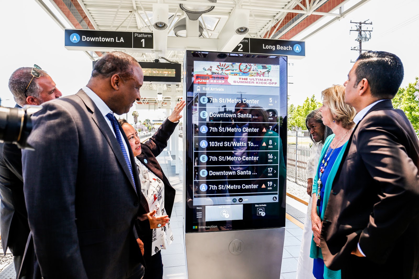
A quick glance at the screen on the platform tells you that there are five minutes until the train arrives. You sigh as you put on headphones, pick a playlist, and wait impatiently for the train to arrive.
Did you catch the brief moment of magic? The quick, low-friction glance at the screen? It took less than a second for you to see when the next train was coming. Less obvious, perhaps, was the epic amount of complexity that went into that single piece of information.
But maybe you’re someone who likes to know how magic tricks work. If so, continue onwards!
Where is the vehicle (physically)
As this post isn’t a thesis on transit tracking systems, I won’t be diving into the differences between technologies like Automatic Train Control (ATC), GPS, communications-based train control (CBTC), Bluetooth, or others.
It’s safe to assume that any transit system you’re familiar with uses one or more of technologies like these for a variety of operational purposes. In all cases, these form the basis of being able to know the answer to the question, “where is the vehicle right now?”
In most cases, this involves a variety of layers:
-
Physical sensors of some kind, such as contact or wireless sensors
-
Connectivity of some kind, primarily to read the data from the sensors, but potentially to have the sensors work together, such as in the case of Bluetooth
-
Raw data transfer, such as simple values (e.g., is the contact sensor activated indicating the presence of a train on the track), more complex values (e.g., RSSI value from multiple wireless detectors), or more location-centric values (e.g., raw latitude-longitude coordinates from a GPS device)
In some cases, such as basic contact sensors, this data will need to be processed in order to convert it into a location value for a given vehicle.
Each transit system may work with one or more providers for this layer. This layer and the resulting raw location data will be the basis upon which we build the arrival times.
Vehicle arrival time
Okay, so now we have location information for each vehicle in our system! In reality, data quality varies from system to system, and there may be dropouts in data from sources like GPS in urban canyons, and from contact sensors when vehicles stop moving in tunnels.
It might be simple to say something like this:
Arrival time = [ (next stop location) — (current vehicle position) ] / (average vehicle speed)
But due to a multitude of factors, such as data quality, traffic, delay conditions, operational issues, platform crowding, and more, you can’t do simple predictions based on location alone
How a vehicle position is translated to an arrival prediction depends on the technology provider. Some use expert systems, involving a variety of tuned variables and programmed heuristics that cover the complex multivariable system that I described.
Others use machine learned-based systems that rely heavily on historical data, both for training a model as well as providing additional features for real-time prediction. Perhaps location PLUS prior 30-second average speed and speed of vehicle+1.
Whatever the particular method of calculation, it’s not simple. Furthermore, it has to operate rapidly. Think back to our original scenario: the arrival information you glance at needs to be accurate such that, when a vehicle is arriving, the display reflects that fact very quickly.
Make it available
We have our arrival predictions! Next, we need to get this information to external developers so that they can use it for displays, apps, reporting, and more!
This involves more hops. Again, it varies by system/technologies/agency/more, but it often looks like this:
- Prediction system
- Database
- Aggregation layer
- API (REST/Protobuf/other) layer
- Various network hops
- Third party
There are various providers that help with the above steps, such as NextBus, OneBusAway, Swiftly, and others. These providers, coupled with alert publishing systems, help agencies to make data available in a useful way.
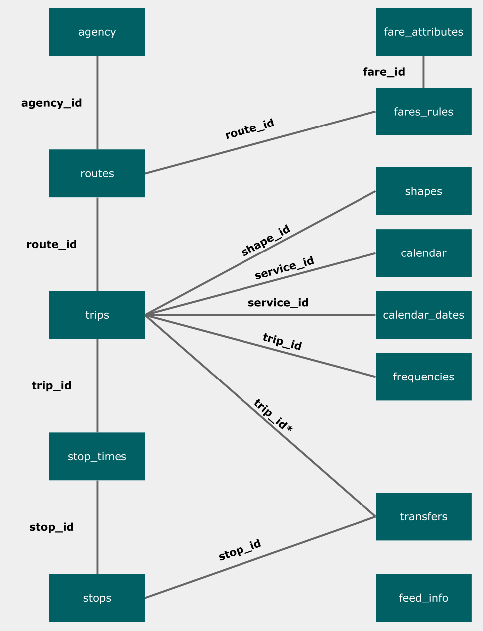
In many cases, transit agencies use standard formats like GTFS Realtime to provide data to the external world. This standard format makes it easier to build products that work with multiple locations.
A third party enters the ring
Now that we have a way for third parties to get the arrival information, places like Intersection can now use the data! My team uses data like this from a variety of agencies, such as LA Metro, Chicago Transit Agency, SEPTA, and MTA, to power our products.
The steps to begin using this data vary from company to company, but at Intersection, a simple flow looks like this:
-
Onboard a transit agency’s data feed as needed
-
Pull from one or more transit agency APIs on a defined basis
-
Process the data into a usable format for our products
-
Provide that information to our products, such as IxNTouch and IxNSight, in an extremely usable and performant way
If you’re interested in more of our thinking and considerations around real-time transit information, I highly recommend checking out Tyler Green’s post,Now arriving: lessons from delivering real-time transit information to smart city kiosks.
It’s important for us to apply the same level of consideration for performance as each transit agency. We focus on making sure that it takes a nearly trivial amount of time to do our own processing, so we can get the information to our products as rapidly as possible.
Take it to the screens
Actually displaying this data can vary by product and company, but often it’s as simple as a speedy RESTful API so that displays and kiosks can get information when they need it.
At Intersection, we’ve created simple authenticated endpoints so that our kiosks can fetch arrivals as needed. This invites further complexity, however, in that we need to make sure the visual display of arrival information, such as on a rotating ticker, is different from the concerns around updating that data.
Done incorrectly, this can result in a poor user experience as a result of flickering and unpredictable animations. In our case, we keep the data update concerns separate from the data display concerns and only updating the display queue when appropriate.
For example, within our IxNTouch kiosk product, we use an interval-based fetch service to automatically retrieve the latest arrival information from our back end. Next, this data is persisted to Redux. In turn, our arrivals ticker component manages its own queue of information to display, thus separating the display concern from the update concern, preventing the poor user experience mentioned above.
Make it usable by humans
There are many dozens of design decisions that take place on a display. These can include things like:
-
How long should each arrival be on a screen?
-
What animation should be used?
-
How should alerts affecting those arrivals be displayed?
-
What logic should be used for rounding? Round up or round down?
-
What does a user believe “0 min” to mean? Should we use “<1 min” instead?
-
How many arrivals into the future do you show? Is this based on a fixed number or time?
These and many other questions are answered by a combination of product, engineering, and UX. As usual, it’s a balance between the ideal state and what is possible given current constraints and context. If you’re curious about some of these decisions, check out Kohzy Koh’s post, Two-way Communications in Transit: Lessons Learned From Designing Public Interactive Kiosks.
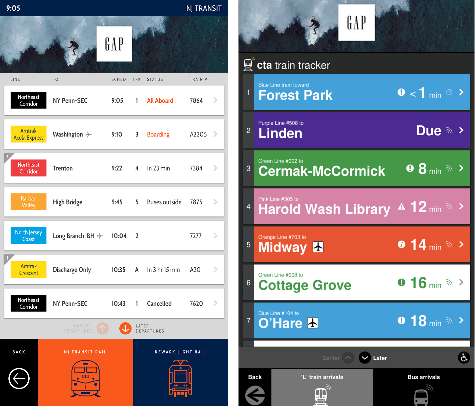
While this is focused on Intersection, these same considerations apply to all arrival tickers and countdown clocks.
That’s a wrap
It turns out there’s an immense amount of complexity that goes into the humble countdown clock. At Intersection, we’ve spent a lot of time thinking about large parts of this process, as arrival information is a critical piece of our transit products.
However, this is just one example! As you go through your daily commute, there are dozens, even hundreds of examples of low-friction, glanceable technology features that require an immense amount of work to accomplish.