Implementing site navigation with the <details> element
Monday, June 7, 2021
Click here to go to all posts.
Create a fast, responsive, clean, and accessible site navigation using HTML and CSS
Demo
If you want to edit the demo live, you can try the version hosted here on CodePen.
Background
When it comes to content-focused websites, I often align with the concept of progressive enhancement, which allows users with different access requirements, such as screen size, physical ability, and bandwidth limitations, to access the same base content fluidly. So, when I looked for opportunities to eliminate nonessential JavaScript from my sites, I decided that the JavaScript-dependent site navigation needed to go.
In overhauling the navbar, I prioritized four areas of design: it should be fast, responsive, clean, and accessible. Visual styles come and go, so prioritizing a “clean” implementation provides a platform for those iterative developments.
Although there are numerous ways of approaching this problem, a few stand out for their popularity and/or efficiency. Some of the most popular methods involve CSS. In particular, they use the :hover selector or :checked pseudo-class. However, I found these to be suboptimal due to the challenge of making them accessible for all users, especially those using assistive technologies, including those covered by W3C in its Web Accessibility Initiative.
Mark Caron, in his post, Responsive, Pure CSS Off-Canvas Hamburger Menu, suggests using the <details> element.
While that approach provided a great starting point, it focused on the fundamentals, rather than a fully responsive experience. When in a desktop view, it is often detrimental to both the user and the site creator to hide navigational elements in a side menu, as it is inherently less discoverable. This is why I established responsiveness as one of my key focuses at the outset of this process.
With these requirements in mind, I put together a working demo that is responsive, works on a variety of devices and browsers, works reasonably well with screen readers, and does not interfere with any of my sites’ existing implementation.
Testing
You’ll notice that I didn’t mention cross-platform compatibility above in my goals. Similar to readable code, I felt that this one goes without saying 😁. To that end, I have tested this implementation on the following devices/browser:
- Chrome on Windows 10, macOS, and Android 11 (v90)
- Firefox on Windows 10 (v86)
- Safari (on macOS 11 and iOS 14)
I have also tested this with the system screen reader turned on for Windows 10, macOS, and Android (TalkBack).
Screenshots
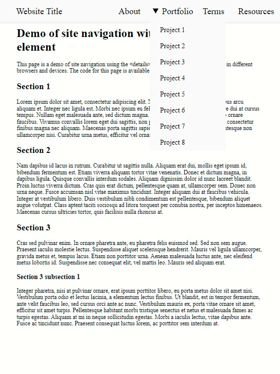
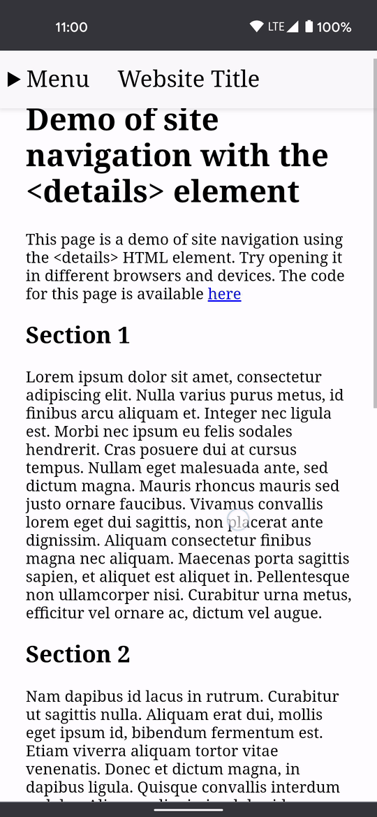
A few screenshots on differently sized devices:
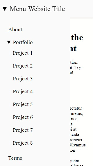
Here is a visual demo of the menu in use on an Android 11 mobile device:
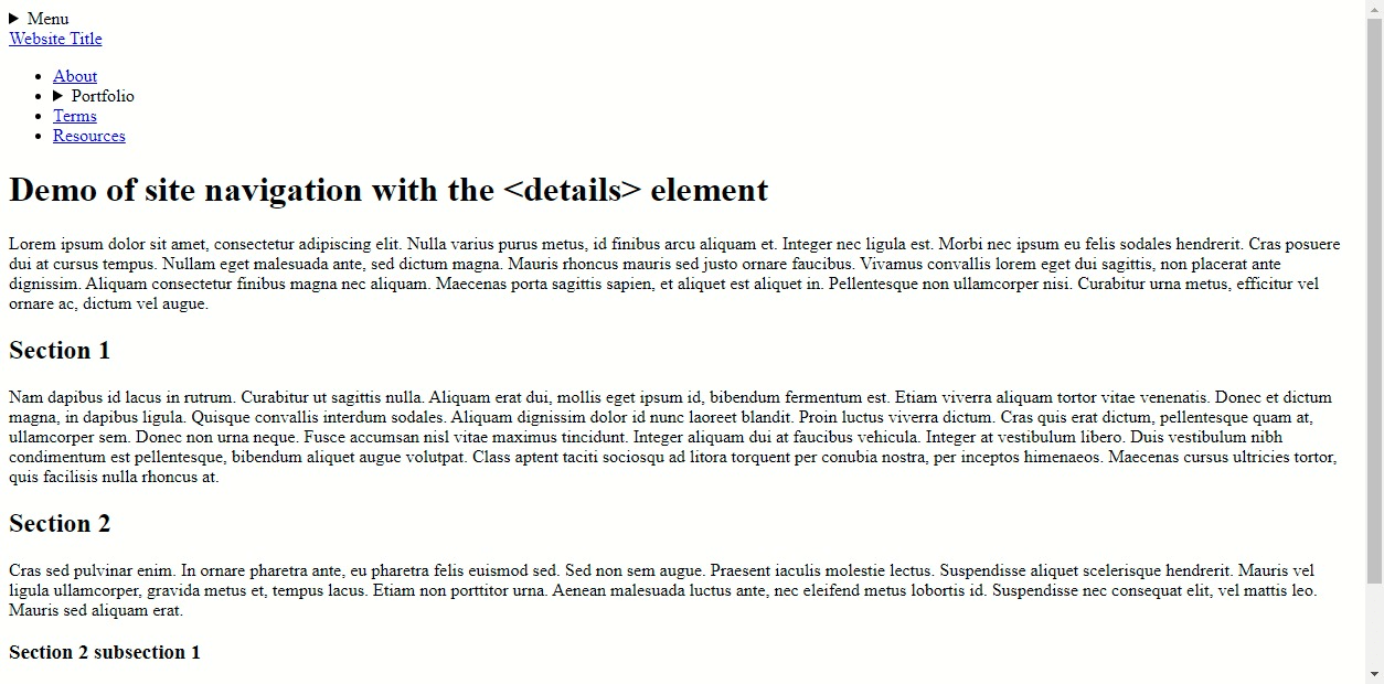
This still functions without any CSS, though it certainly could look better:
Future enhancements
Feedback is greatly appreciated. I am sure many improvements could be made to this implementation. There are also likely enhancements that will further improve the experience with screen readers, as well as other assistive technologies to which I do not have immediate access. Feedback from the community always goes a long way in helping to cover the wide variety of devices out there!