A CSS Pixel and a Kiosk Walk into a Bar
There are pixels and then there are CSS pixels
Thursday, March 14, 2019
Click here to go to all posts. Also published on the Intersection blog
As many web developers know, perfectly formulating your cascading style sheets (CSS) is one of the most difficult parts of summoning a web app into existence. A pixel here, a margin there; gaining that perfect one-to-one match with the Photoshop/Sketch/Axure mock-ups is the right of passage for any front-end engineer.
In fact, it’s almost as if the early economists gained a brief glimpse into the future of what were then artisans and craftsfolk and, out of sudden fear of what they saw, documented the concept of “diminishing returns” specifically to ward off any attempts to achieve what can only be called CSS nirvana.
But I digress. What does this have to do with kiosks?
Developments in CSS land have made it easier to handle the proliferation of new devices, such as smartphones, tablets, and touch-enabled-everything. As it turns out, those same developments have laid several traps for engineering non-traditional web experiences, such as the kiosks we deploy at Intersection.
Today’s example is the misunderstood CSS pixel.
First: what’s a pixel?
As someone who has been long-interested in digital photography and video, I’m quite comfortable talking in pixels. Whether it’s the Sony Mavica with its glorious <1 megapixel shots, the relative beauty of the first 1080p TV I owned, or the modern sorcery of the 2960x1440 screen on my phone, these devices all have physical pixels. For the sake of this post, let’s just consider pixels to be the individual dots that make up a screen or image.
Enter from stage left: the CSS pixel.
As most of you already know, CSS pixels are not a one-to-one match with device pixels. A great place to start reading on this is the web platform docs found here.
Here’s the relevant bit straight out of the W3C standard:
For print media at typical viewing distances, the anchor unit should be one of the standard physical units (inches, centimeters, etc). For screen media (including high-resolution devices), low-resolution devices, and devices with unusual viewing distances, it is recommended instead that the anchor unit be the pixel unit. For such devices it is recommended that the pixel unit refer to the whole number of device pixels that best approximates the reference pixel.
Basically: a CSS pixel is meant to be a measurement that relates to how we perceive content, rather than to the physical resolution of the display. That’s pretty cool. And possibly a recipe for confusion.
How this works in practice
Now, that sounds great, but as usual, the devil is in the details.
On most devices, be they phones, laptops, tablets, or other odd configurations, you will be running an operating system that tries to scale to the display size. Over the last five-to-seven years, macOS and mobile platforms have been good at this, while Windows and Linux have lagged a bit behind in their support for “HiDPI” displays.
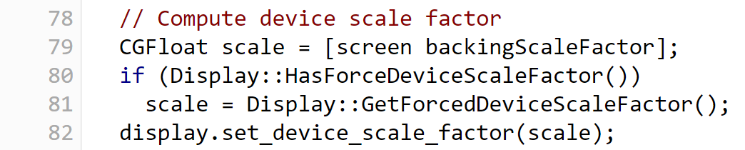
The exact mechanics vary, but the browser will try to determine the scaling set on the operating system and apply that for pages loaded. For example, here’s the source code in Chromium that determines the scaling on macOS. The relevant snippet:
If you’re curious about your own device, you can see your info on sites like MyDevice. Scroll down on the site to see common physical and CSS sizes.
What’s fantastic about this is that engineers don’t necessarily have to build sites for the high-resolution displays. Instead, they can rely on the browser and operating system to do the heavy lifting.
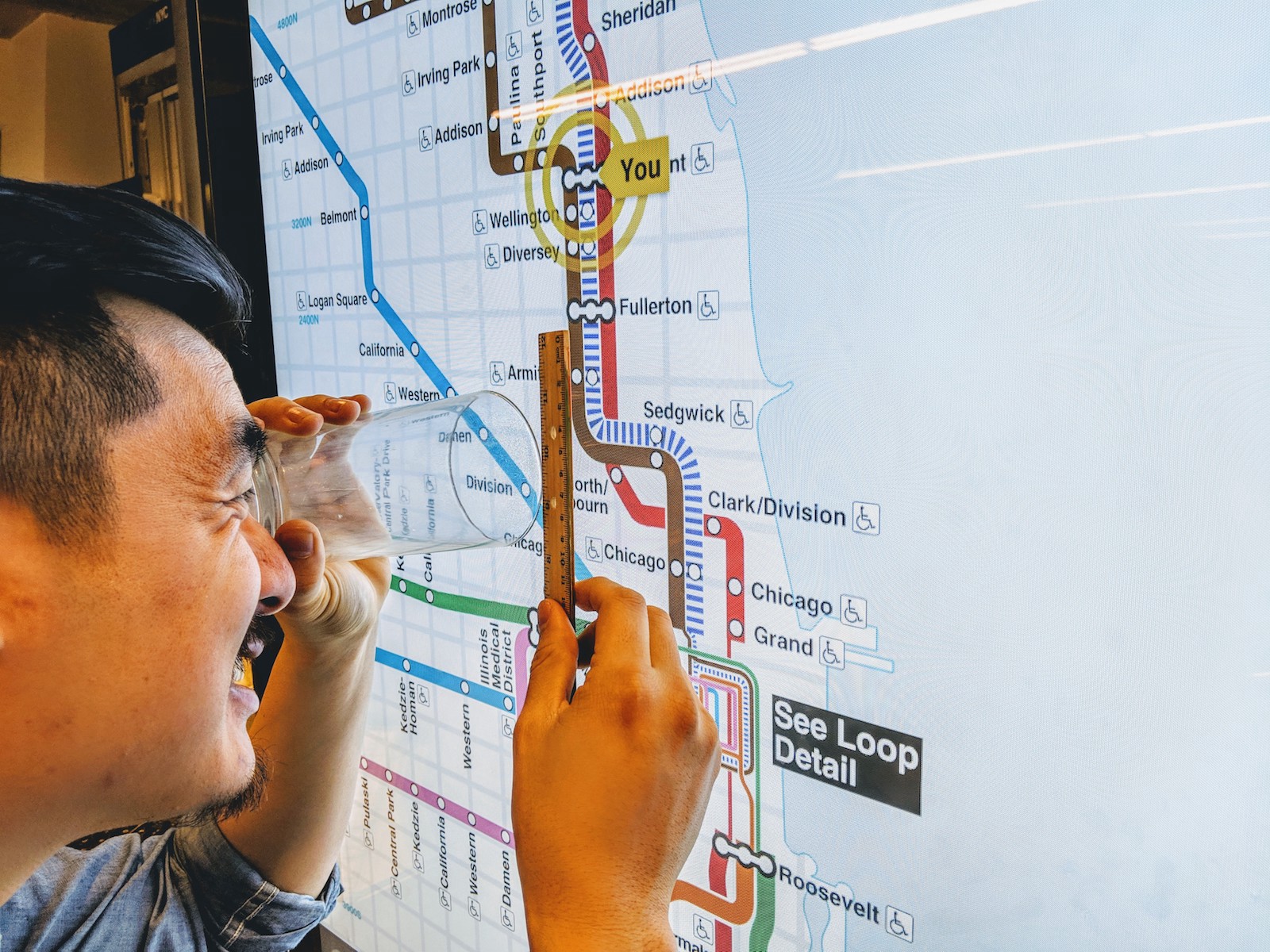
Except, this doesn’t always apply. Especially not when the web app is on a kiosk.
As mentioned in previous posts, we run a stack with Ubuntu 16.04 LTS and a Chromium-based player. Let’s consider a few points first:
-
Our Ubuntu stack does not have scaling applied to X Server by default
-
Chromium relies on the X Server scaling to determine the device pixel ratio
-
Since we are using a player built using CEF (Chromium Embedded Framework), there’s no guarantee that it will respect the same configuration as pure Chromium
Since making a deal with a cross-device deity isn’t an option, what’s our solution?
How this works on our kiosks
Fortunately, the world has been nudging front-end engineers to move on from the (somewhat overloaded) CSS pixel for years. It just so happens that we’ve been nudged a bit harder than most. Specifically, we make heavy use of rem, %, and, where necessary, viewport units (vh/vw).
Why not em, you ask? Check out the history of the em unit and then come back. Beyond that, rem is a far more sensible option for us.
In particular, rem turns out to be perfect for our kiosk scenarios. For a recent enhancement to our IxNTouch web app, we needed to support both 1080 and 4K displays in both portrait and landscape mode. The desire was for the interface to be the same physical size to a user, but with greater fidelity due to the increased screen pixel density.
Since CSS media queries refer to the physical device pixels and not the CSS pixels, we can can easily detect when a rem unit should be, for example, doubled from 16px to 32px, thus scaling our interface correctly from a 1920x1080 screen to a 3840x2160 screen. Unlike em, we can just set this at the document root with something like this:
/* Double root font size for 4K displays */
@media (min-width: 2000px) {
    html {
      font-size: 32px;
    }
  }
Of course, that’s not the end of our story. Matching our development environments to the production kiosks is trickier than expected. We regularly test with both 1080p and 4K displays connected to MacBooks. The catch: depending on the external display connected, macOS may or may not set a scaling factor to the display.
With a 2018 MacBook Pro, connected to:
- the recently acquired 27-inch LG 4K testing monitors? Default scaling works
- a 55-inch Samsung TV with a touchscreen overlay? No default scaling
- a 55-inch screen in one of our kiosks? No default scaling
To get around this and maintain consistency (and sanity), you can do one of two things:
- Use the Chromium startup flag
--force-device-scale-factor=X, where X is the scaling you want to apply - On macOS, hold down the
Optionkey when looking for scaling options in display settings, so that it presents you with all possible options (including the native 3840x2160 resolution)
Knowing the stack is important
Similar to my previous post about multi-touch being more of a challenge than anticipated, this is another example of needing to better understand the web platform upon which we build our web app.
In many ways, this has helped me gain a newfound respect for CSS. While it doesn’t change the fact that trying to match in-app CSS to a Photoshop-based mock-up is the Ninja Warrior challenge for front-end engineers, it has given me a greater appreciation for the level of abstraction that operating system and browser engineers have tried to provide for web app creators.