Recap: Transit Techies NYC #4: Four the Love of Transit
Thursday, October 18, 2018
Click here to go to all posts. Also published on Medium
A quick recap of Transit Techies NYC #4: Four the Love of Transit, a meetup held on Wednesday, October 17, 2018
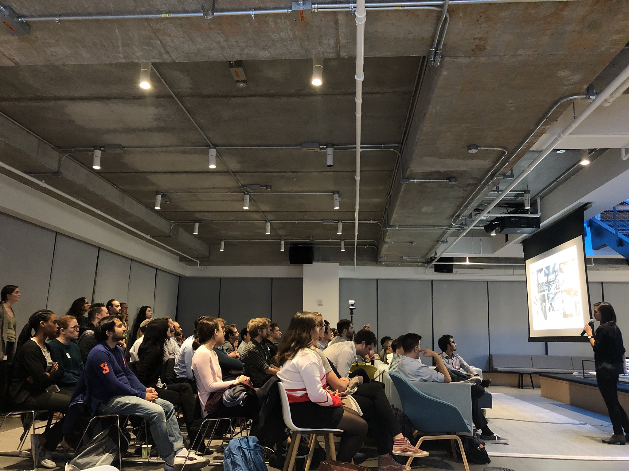
Transit Techies NYC #4: Four the Love of Transit was an amazing meetup, with 80 attendees from a diverse set of backgrounds and experiences.
Update: you can check out the recordings for this meetup on YouTube!
Kohzy Koh and Tyler Green kicked us off with a thank you to everyone for attending and a quick mention of Intersection for hosting. They (jokingly) suggested that all of the evening’s scheduled sessions be replaced with a watch party…but alas, the video “didn’t load.” 😂
Kohzy and Tyler also did a quick recap of one of the sessions from TransportationCamp NYC, which occurred this past weekend. In particular, folks should check out https://mobilitydata.org, which is an effort to improve mobility and accessibility data in GTFS feeds.

Scraping and Analyzing Real-time NJ Transit Rail Data
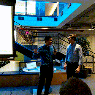
Our first session of the evening was “Scraping and Analyzing Real-time NJ Transit Rail Data” by Pranav Badami and Michael Zhang. Nine months ago, they were working at the same consulting firm, and they decided to collect and analyze NJ Transit data since March 2018.
NJ Transit is the third largest train system in the country. The data they collected is not publicly available from any other source, as NJ Transit only makes aggregate data available for historical periods.
They started by scraping data from NJ Transit DepartureVision. From the main DepartureVision status page, they could drill into specific trains, which they then extracted into an array of statuses. The software continues doing this for a given train until all stops show either “departed” or “canceled, “ at which point the data is packaged up as JSON. Next, they built a parser. This part handled converting the raw data into a clean tabular format, which accounted for issues like data at a particular moment reverting to a previous state.
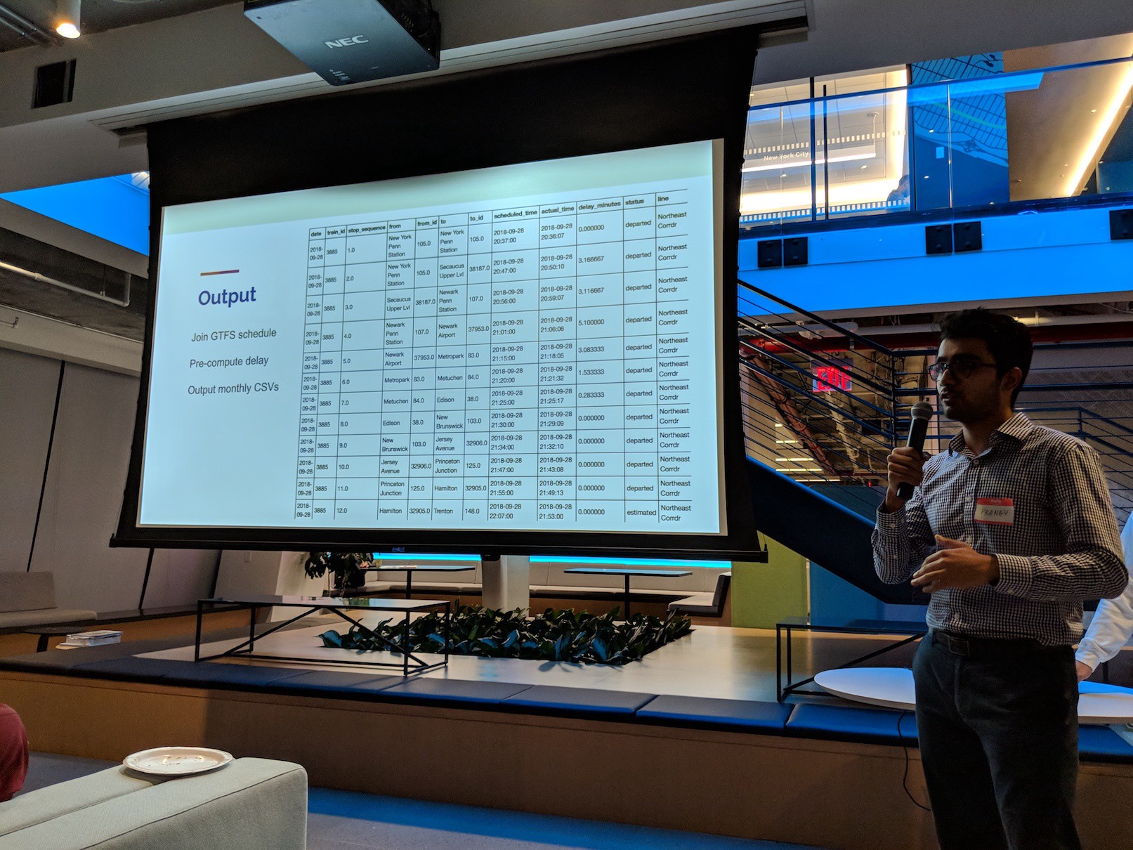
They joined the data with GTFS schedule information, and also outputted monthly CSVs.
So far:
- Collected data on 156,000+ trains
- 98.6% of trains were captured correctly so far
- Data is open sourced on Kaggle: click here: https://www.kaggle.com/pranavbadami/nj-transit-amtrak-nec-performance
Since they started collecting the data, they’ve also done some analysis. For example, they looked at significant weather impacting trains in March. You can take a look at one of the posts here: https://towardsdatascience.com/the-5-stages-of-a-system-breakdown-on-nj-transit-8258127e31e9
Based on the analysis, they see clear opportunities for communication improvement and transparency, as well as better data directly from NJ Transit. Future steps/calls to action include analyzing the data on Kaggle, public dashboards, and more!
One question was about whether or not mitigating actions enacted by NJ Transit during various events are able to be captured by this. The second question was about one of the graphs, and what the negative numbers of trains represent. Essentially, there is a deficit of trains compared to the scheduled number of trains during a snowstorm when many trains are canceled.
Project Subway
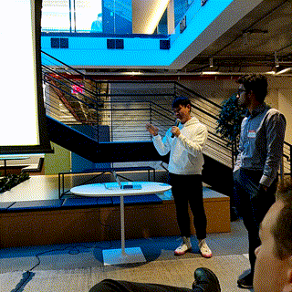
Next up was Candy Chan to talk about her work on the New York City subway representing the “The City Under the City.” For example, with a neighborhood map, you might see an outline of the underground station. Directions like “NW” or “SW” don’t help orient folks who are trying to determine which exit to take, and folks are often better off just asking for directions.
She also talked briefly about art versus information, and how that related to work like subway maps. The question is, how do you communicate complex concepts in the most effective way you can? Candy explored existing subway maps, including maps that show all lines and hand-drawn maps. She also took inspiration from maps like Hong Kong’s transit system map, which is more sterile and informational, and artwork, which is more friendly.
Candy started with pen and paper, and doing things like counting the number of steps. She took this through multiple iterations, with the later drawings including color-coded lines and multiple stations.
Next, she questioned whether or not the average person would understand her work. She again looked to places like Hong Kong, where station exits are lettered, and Tokyo, where train displays update constantly. She also looked to New York City precedents, like “Exit Strategy.”
To create these maps, she combines existing CAD models, further models from places like Google Earth, added ornamentation and design elements to above-ground buildings, and the from-scratch underground models themselves.
A question was asked about how Candy translates her drawings to the physical space. She uses a combination of data like train and platform lengths, as well as physical markers like train exists to position her models against physical space.
You can check out all of Candy’s work on the Project Subway NYC website!
Status Quo — Everything Sucks
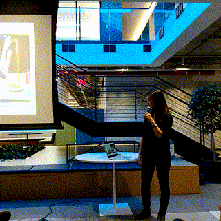
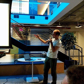
The next speaker was Alex Bell from Intersection. He’s a bicyclist, and he felt that bike lanes are always blocked. That’s how he got started on this project.
His first attempt was suing UPS. It didn’t go his way the first time. Nor the second time 😂
The question was, how can he prove what the major blockers of bike lanes are?
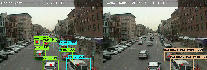
He started by pulling images from the New York City Department of Transportation (NYC DOT) publicly available camera feeds. He annotated around 2,000 images by hand so that he could train a TensorFlow-based model on what trucks and cars are in the images he captured.
Next, he marked off (hard coded) the different regions of the image feed to annotate where bike lanes, bus lanes, and certain parked cars were. This is one of the issues with the current code; hard-coded regions on the images. That means that this system would fall apart if the NYC DOT rotates any of its cameras!
An article about this ended up in the NY Times (due to Alex’s persistence!): https://www.nytimes.com/2018/03/15/nyregion/bike-lane-blocked-new-york.html
It wasn’t until Alex started at Intersection and connected with NYC DOITT that the project came back up. Now, the code is running in AWS and processes all 700 NYC DOT feeds once a minute and annotates the each image in a tenth of a second.
Anders Lisdorf from the New York City Department of Information Technology & Telecommunications (DoITT) came up. This type of technology has the possibility to improve a variety of situations, such as firefighters being able to more quickly locate a traffic accident. In general, traffic cameras are an untapped resource for city intelligence.
NYC DoITT has created an innovation lab to engage in work like this!
You can check out and contribute to Alex’s work by visiting the repository here on GitHub.
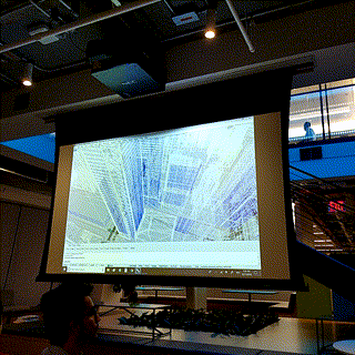
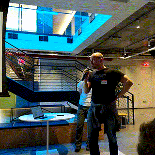
TunnelView: Spherical Imagery of NYCT
Kurt Raschke from New York City Transit (NYCT) came up to discuss how they have implemented TunnelView. This all started with the question, “why can’t we have Google Street View of the subway?”
This would help answer questions like “what does the track look like now” and “has it changed since the last time photos were taken?”
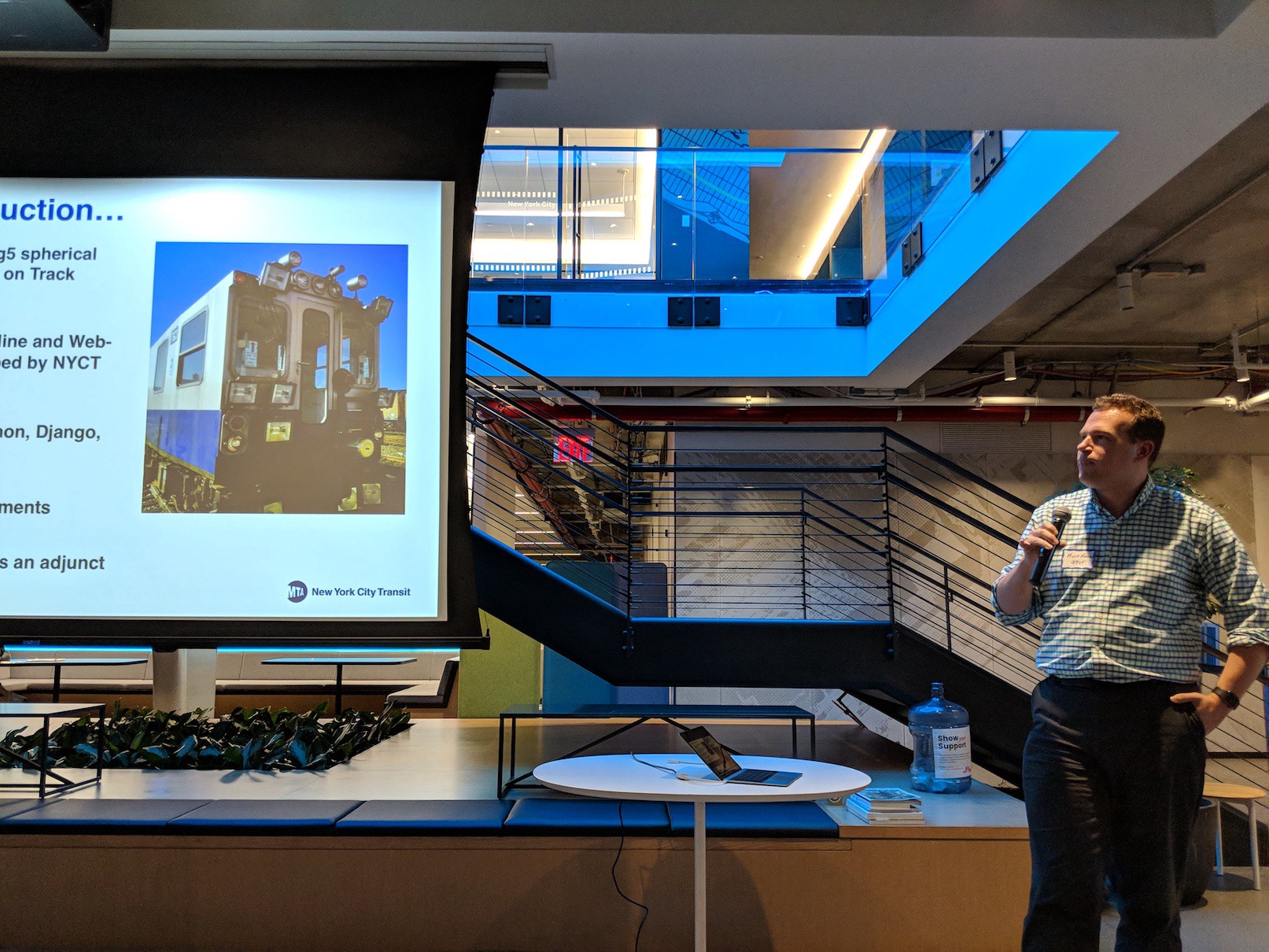
NYCT already has Track Geometry Cars that go out and capture information about tracks, so they’ve added spherical cameras permanently to Cars 3 and 4. They’ve built out a tech stack behind it as well, using tools like PostGIS, Python, Django, Leaflet, and more.
This system now gets used for nearly everything, with 1400+ users looking at situational awareness, site surveys, and more! Most of this user growth has been organic so far.
Interesting question: how does location work? The analyst on the train actually pulls up to a known location, puts that in, and then using wheel rotations, location is tracked. Pretty cool!
This is all in a modern interface that is comparable to what a consumer would expect. They’ve also added stations (with 2D plans), as well as interesting areas like elevator shafts.
Next steps include areas like covering more areas off the right of way, or tying in with the NYCT asset tracking system.
One question was, “have you considered adding spherical cameras to revenue rolling stock [regular trains]?” The answer is “no,” since the capture from the special cars is frequent enough for the purposes it serves.
Another question was about whether or not they’ve socialized this with other transit operators. They actually picked up the idea from Japan, but they don’t think that many other systems are doing it.
And that’s all for today folks! Make sure you check out Transit Techies NYC for more meetups! You can also check here for links to previous recaps and slides or go here to see the recordings for this meetup on YouTube.
If you liked this post, let me know, and share with others!