Recap: Transit Techies NYC #6: Six-Car Train
Friday, February 8, 2019
Click here to go to all posts. Also published on Medium
A quick recap of Transit Techies NYC #6: Six-Car Train, a meetup held on Wednesday, January 30, 2019

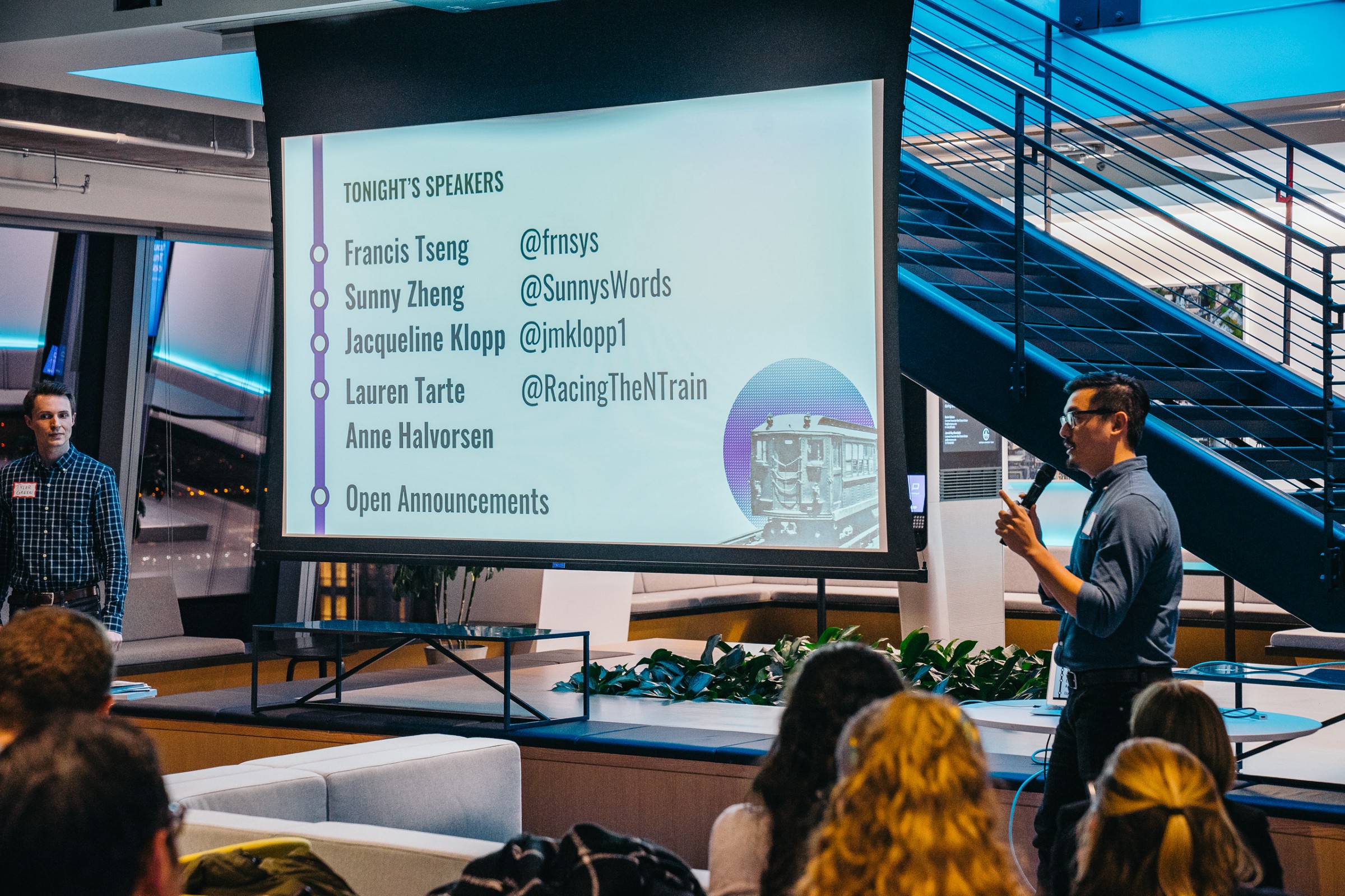
Tyler Green kicked off the session with a few housekeeping notes. As usual, we started off with a gag!
Kohzy Koh lamented about the lackluster check-in process, but we’re not sure whether the “front desk shutdown” was going to occur. L-train burn! 🔥😆
They also mentioned the website is now up for Transit Techies NYC! You can check it out here: https://transittechies.nyc
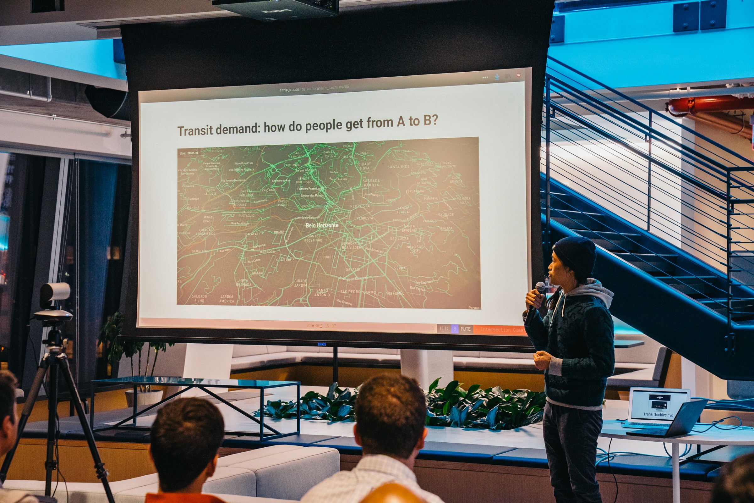
PolicySpace — Francis Tseng
First up was Francis Tseng to present about PolicySpace. Francis’ background is in simulation and machine learning.
This particular project involved working with a researcher in Brazil. He worked on modeling transit demand based on various changes in the urban landscape. This involved treating roads as FIFO queues, treating spaces as continuous, and modeling both public and private transit.
One of the techniques used is called agent-based modeling. In order to model things like a flock of birds, it involves setting parameters on specific elements of the model and seeing how they interact and affect the overall system. Another technique used is called discrete event simulation.
5.1 million agents were simulated, which did run into performance limitations and memory constraints. It took 16 hours to do one run!
The modeling used inputs like OpenStreetMap data and GTFS data for routes, stops, and trips. There were many challenges in marrying this data, and he encountered many issues, such as going through the routing by hand to figure out why a route wasn’t found.
Another issue was an instance where public transit was 3x-5x slower than private transit. It turns out that is actually true for various reasons, and Francis validated against alternative maps.
The simulations are contingent on things like the quality and availability of data (of course!).
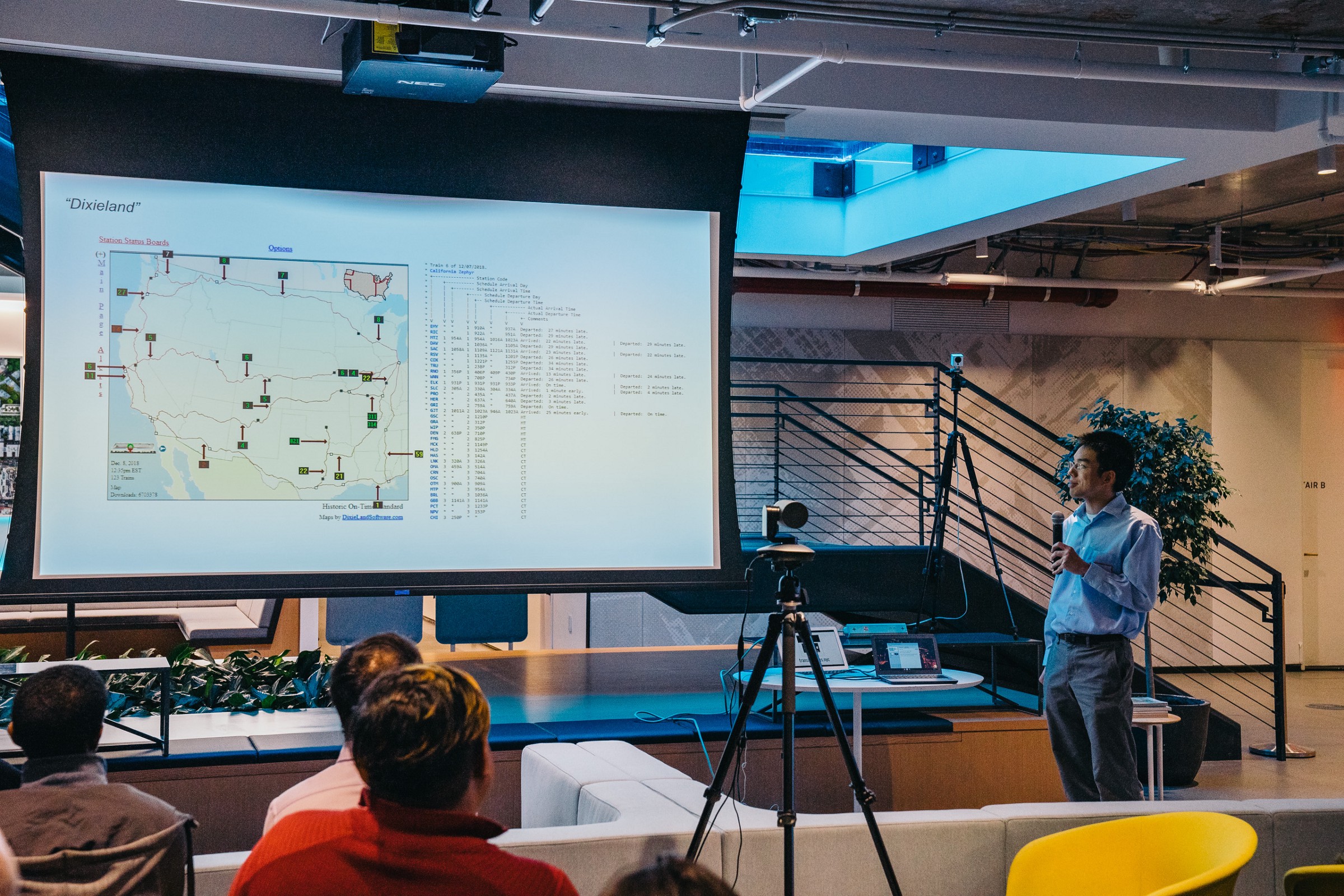
Real-time Amtrak Data — Sunny Zheng
Next up was Sunny Zheng to talk about real-time Amtrak data!
For a bit of history, there was a older site that provided Amtrak data, but it wasn’t great. Amtrak released a site with real-time data, but the UI left room for improvement.
Sunny dug through the source to figure out the data source. This also changed later, when the Amtrak site switch from the Google-based data source to a more blob-data-oriented format, that Sunny essentially had to reverse engineer. Turns out that it involved multiple base64-encoded strings and running a decryption process on it…twice!
This involves about 280MB/day in raw JSON, with many thousands of data points. The Amtrak RTTL app has been improved, but perhaps not as much as folks would like.
Sunny walked us through a demo, even though today the Chicago hub is shut down (due to serious sub-zero weather).
A question was asked about why Amtrak doesn’t comply with open data policies even though it is heavily subsidized by the government. Turns out that they will give you a static GTFS feed if you submit a FOIA request, but by then it’s out of date ☹️
Digital Matatus Project — Jacqueline Klopp
Jacqueline Klopp came up next to talk about popular transport, which is the most used form of transit in cities around the world. This also has an impact on climate change, since transforming transport can impact carbon output. This type of transit is run by private operators and does not have the markings of a formalized “public transit system.”
Part of this is about moving more towards mobility-as-a-service with data as the critical underlying infrastructure.
In that vein, the Digital Matatus is about using the cellphones that are in nearly everyone’s hands to build up the necessary open data for locations that do not have formalized public transit systems. This involved working with the Nairobi students to map out the transit system. For example, there was a huge number of stops that were informal, based on the patterns of where drivers would drop people off. This data was then picked up and used to do network analysis.
The project also created GTFS data good enough to upload to Google Maps, and there are about 300,000 uses of the data every week, which shows that there is significant demand. In other cities, data like this is ending up on multimodal planning screens.
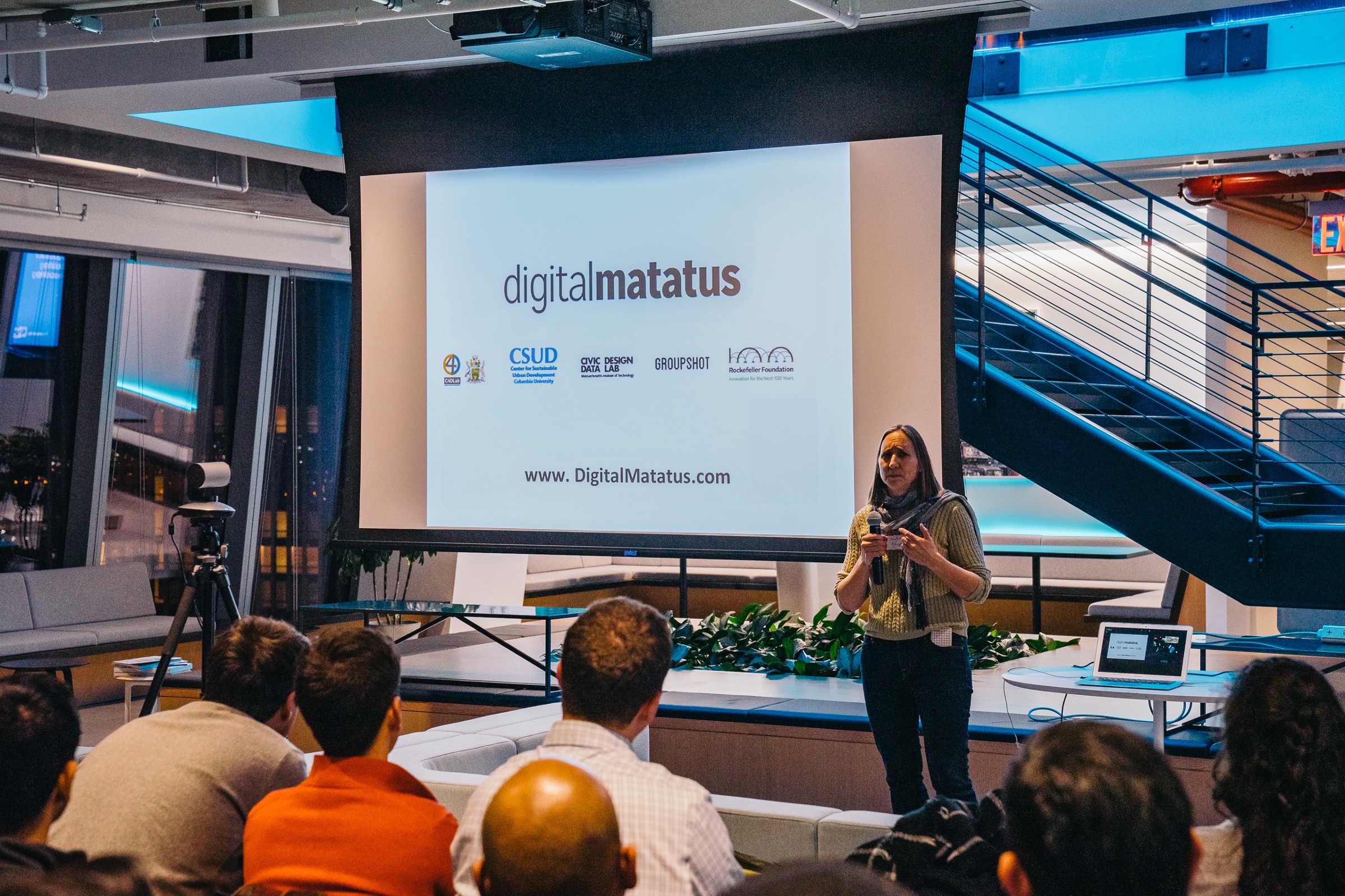
Jacqueline highlighted that we need better tools, especially where there are no transit agencies. Additionally, we need to rethink standards like GTFS to incorporate the reality places like Nairobi.
Part of this is getting people involved and creating open source and open data! 🙂
MTA Performance Dashboard — Lauren Tarte and Anne Halvorsen
Our final presentation for the evening was by Lauren Tarte and Anne Halvorsen to talk about the public performance dashboards by the MTA. The transit system wasn’t in a great operational state, so the project was started out of a need for greater public transparency. Here’s one of the sites calling out the need for a better dashboard: http://transitcenter.org/2017/08/31/mta-five-qualities-of-a-useful-public-dashboard/

To build the dashboard, they started with vehicle data (AVL). The MTA also did a lot of research around what makes for good public-facing metrics. They ended up with these three metrics:
- Additional platform time
- Additional train time
- Customer journey time performance
Calculating these involved a lot of data and analysis, which included areas of performance wins, such as dropping one calculation from two days to 45 minutes!
The original front end was Power BI (for a number of reasons). They rebuilt it using open source technology.
You can see it here: http://dashboard.mta.info
If you liked this post, let me know, and share with others!